
Aavegotchi
NFT Game Onboarding & UX Redesign
Project Overview
Brief :
Redesign a new desktop website that looks more like an app without changing the branding and buttons.
Create structure and space for current games but also upcoming ones.
Based o the research (main job to be done) come up with a smooth user flow.
Find out what users should see before and after login/connecting to the wallet.
Client: Pixelcraft Studios
My role: User Research & Strategy, Redesign, Design Thinking
Team members: Sükran Sahin & Milena Popovic
Devices: Desktop
Scope: 2 weeks - Final bootcamp project , March 2022
Product / About the Aavegotchi
Aavegotchi is a crypto collectible game where participants can purchase and grow Aavegotchis, Non-Fungible Token (NFT) comes as unique pixelated ghost avatars used to explore and interact with Aavegotchi’s digital universe. Decentralised finance or DeFi (an alternative finance system based on blockchain technology) used to guarantee authenticity and value of each NFT. Rarity ensures value , and value is increased by buying NFT accessories (“wearable”) or traits. Aavegotchis need to be cared for to gain value.
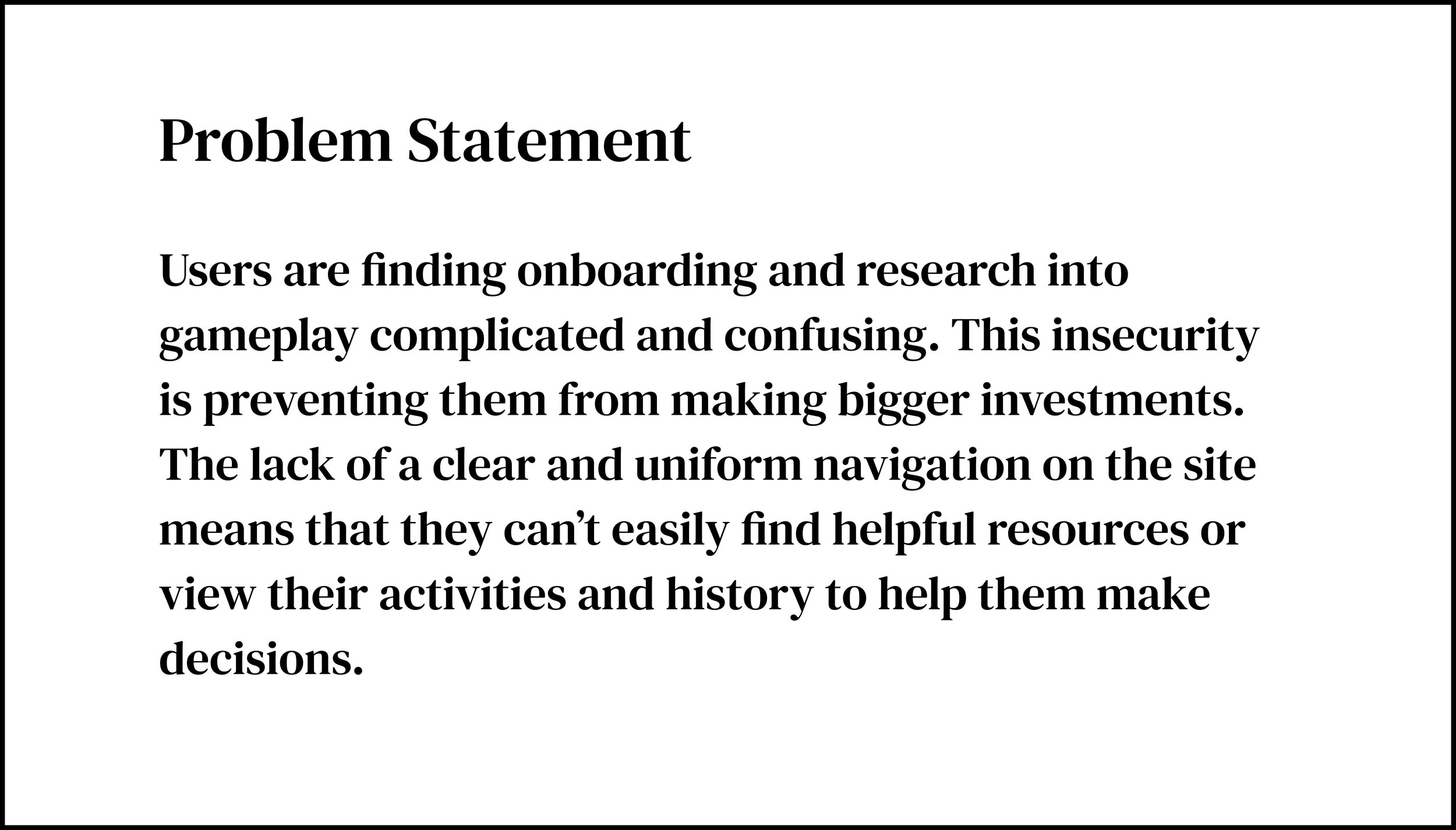
Problem
Upon reviewing the stakeholder brief and conducting additional user research, it became clear that the main challenge was the onboarding process, as well as the unclear game structure and user flows. These issues created significant barriers for new players trying to engage with the game.
My Contribution
I ran UX research, analyzed user needs, and redesigned the onboarding flow to help new players understand and engage with Aavegotchi more easily. I also refined the desktop interface to feel more intuitive and app-like, improving the overall experience while keeping the design aligned with the brand.
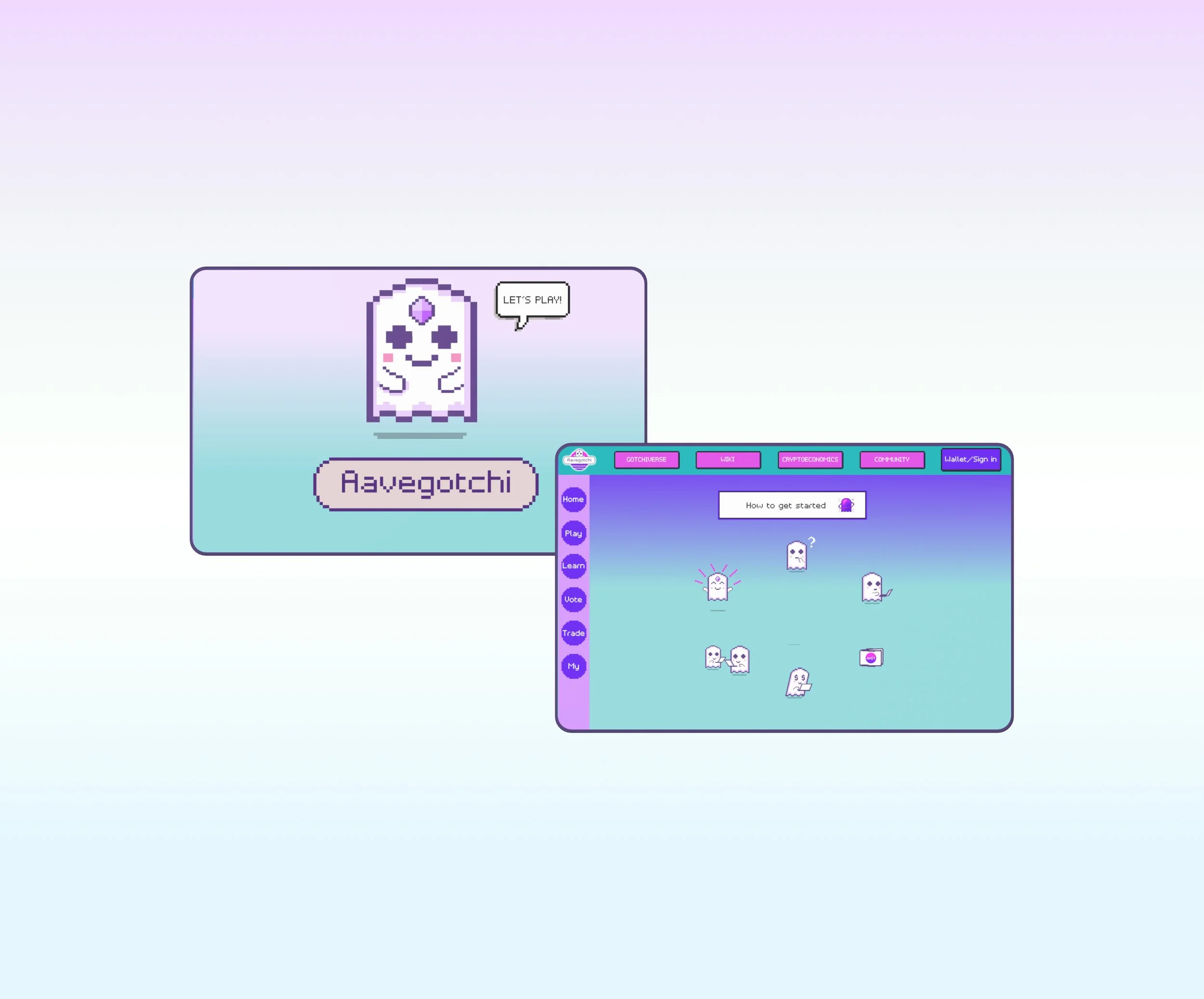
Redesigned onboarding flow
Desktop interface prototype
UX research insights
Competitor Business Analysis
Before going into defining the problem, we checked the existing market. The NFT games which are leading in the market were Axie Infinity, CryptoKitties and The Sandbox.

Research
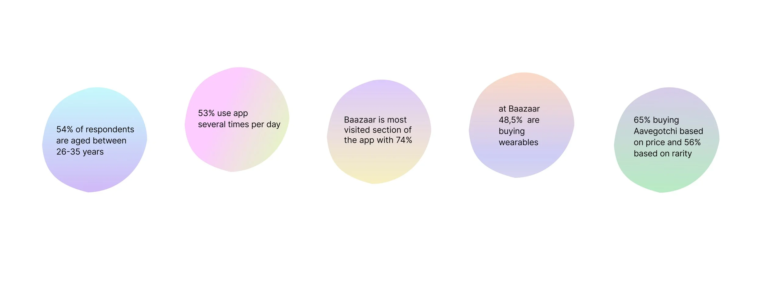
To better understand Aavegotchi’s user base, their in-game preferences, and the challenges they face, we conducted a detailed survey. The insights gathered helped us identify pain points and guided the redesign of key user flows.
Survey Results / Key Findings
New users found the initial steps to enter the game confusing.
Users were hesitant to make in-game investments due to unclear game structure.
The in-game marketplace, Baazaar, emerged as the most visited and popular section, indicating a critical area to focus on for improving onboarding and guidanceTo gain a deeper understanding of Aavegotchi's user base, their preferences within the game, challenges theya re facing and areas for potential improvement, we conducted a detailed survey. The responses collected have provided invaluable insights, guiding us in redefining and optimizing specific user flows as part of our redesign efforts.
Interviews
Building on our survey insights, we conducted in-depth interviews with 9 Aavegotchi players to truly understand their experiences, frustrations, and motivations. These conversations were rich and detailed, giving us a deeper understanding of how users interact with the game, what excites them, and where they encounter difficulties. Talking directly with players allowed us to uncover insights that surveys alone could not reveal and helped us empathize with their journey from the very first steps in the game.
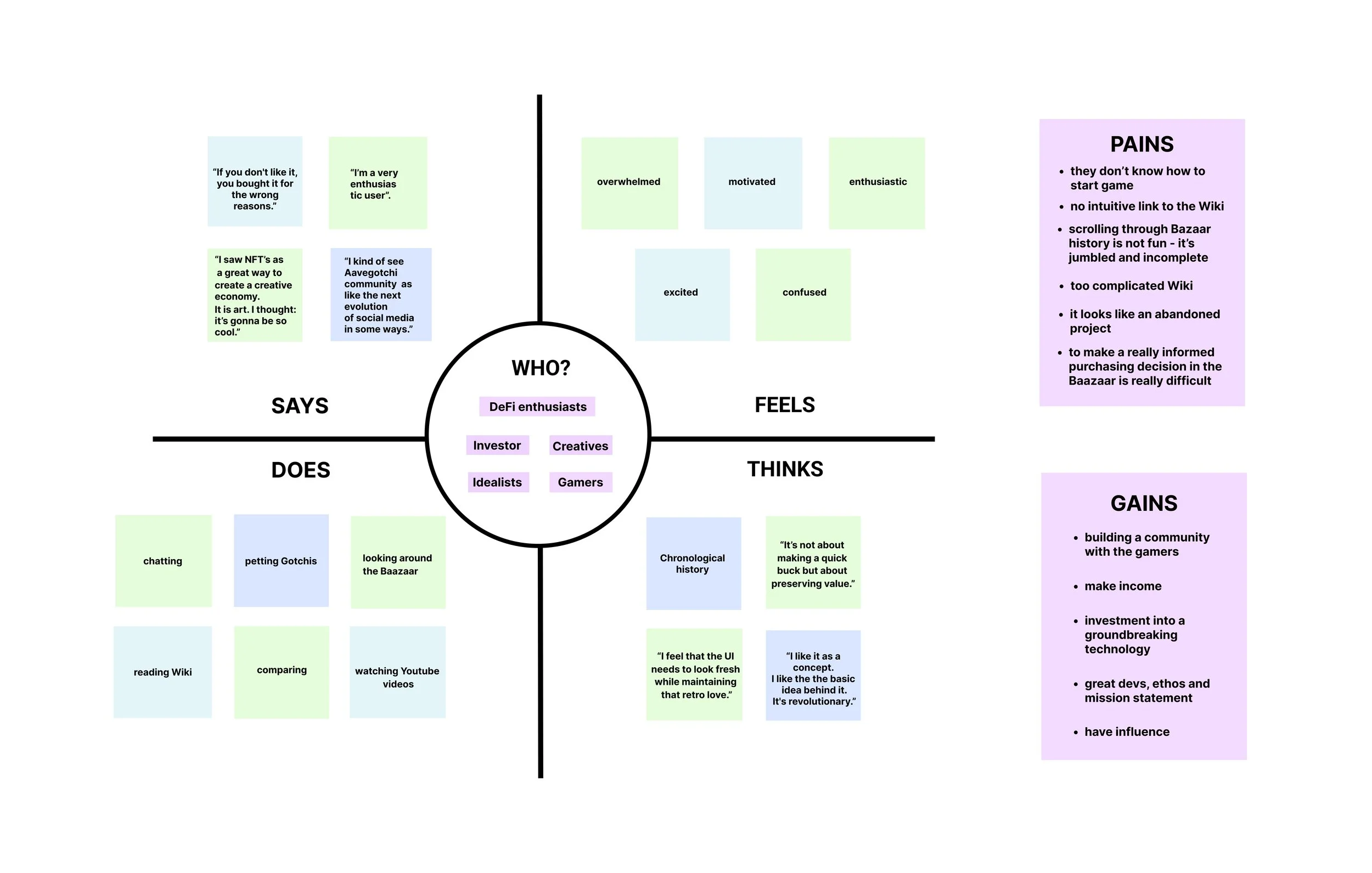
Empathy Map
We translated the interview findings into an empathy map, grouping users based on their interests, play frequency, and familiarity with the game. This process highlighted key Gains and Pains, showing us not only what users do, but also how they feel, think, and communicate about their Aavegotchi experience. These insights became the foundation for our redesign decisions, ensuring that every change we made was rooted in real user needs.
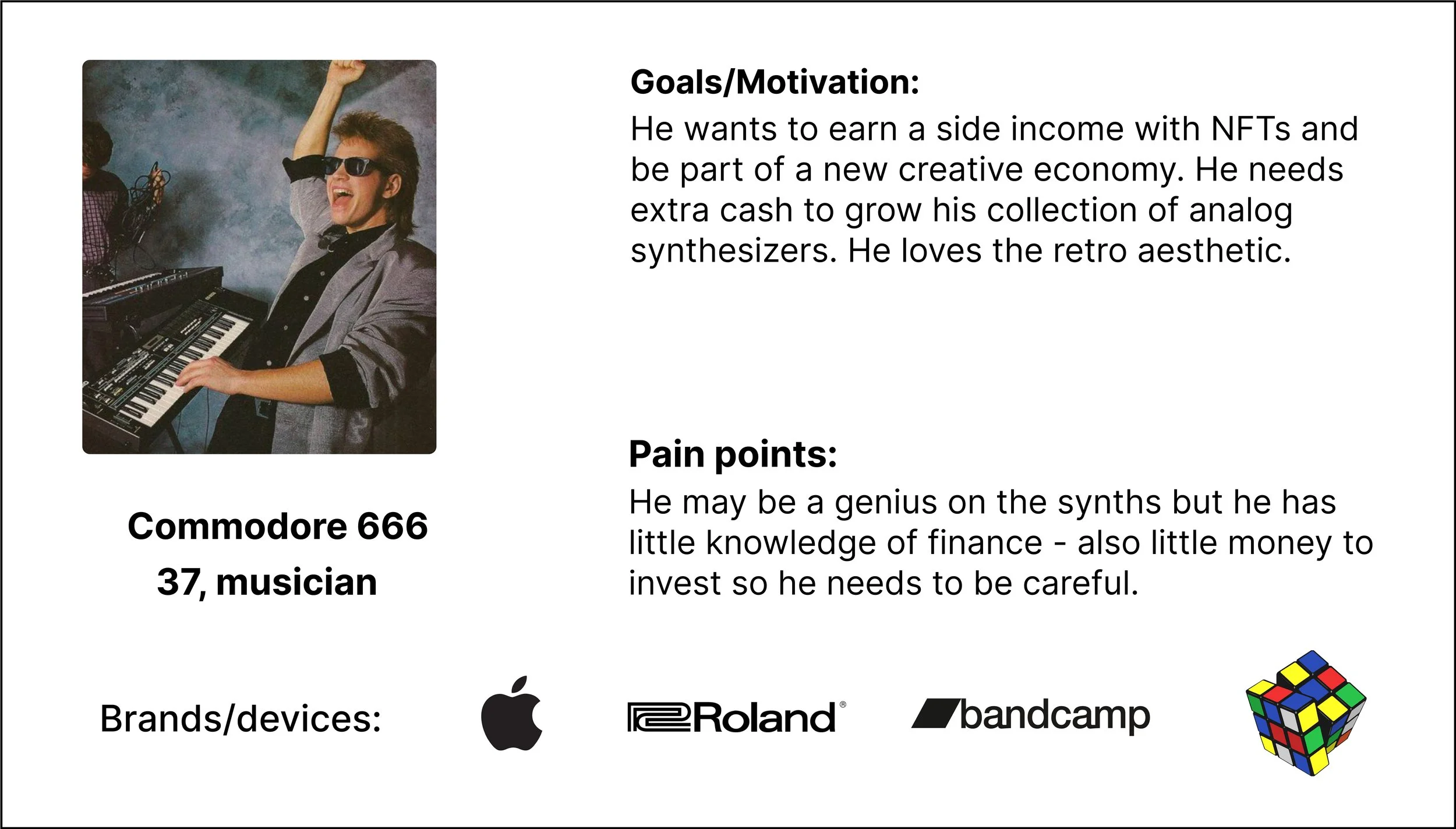
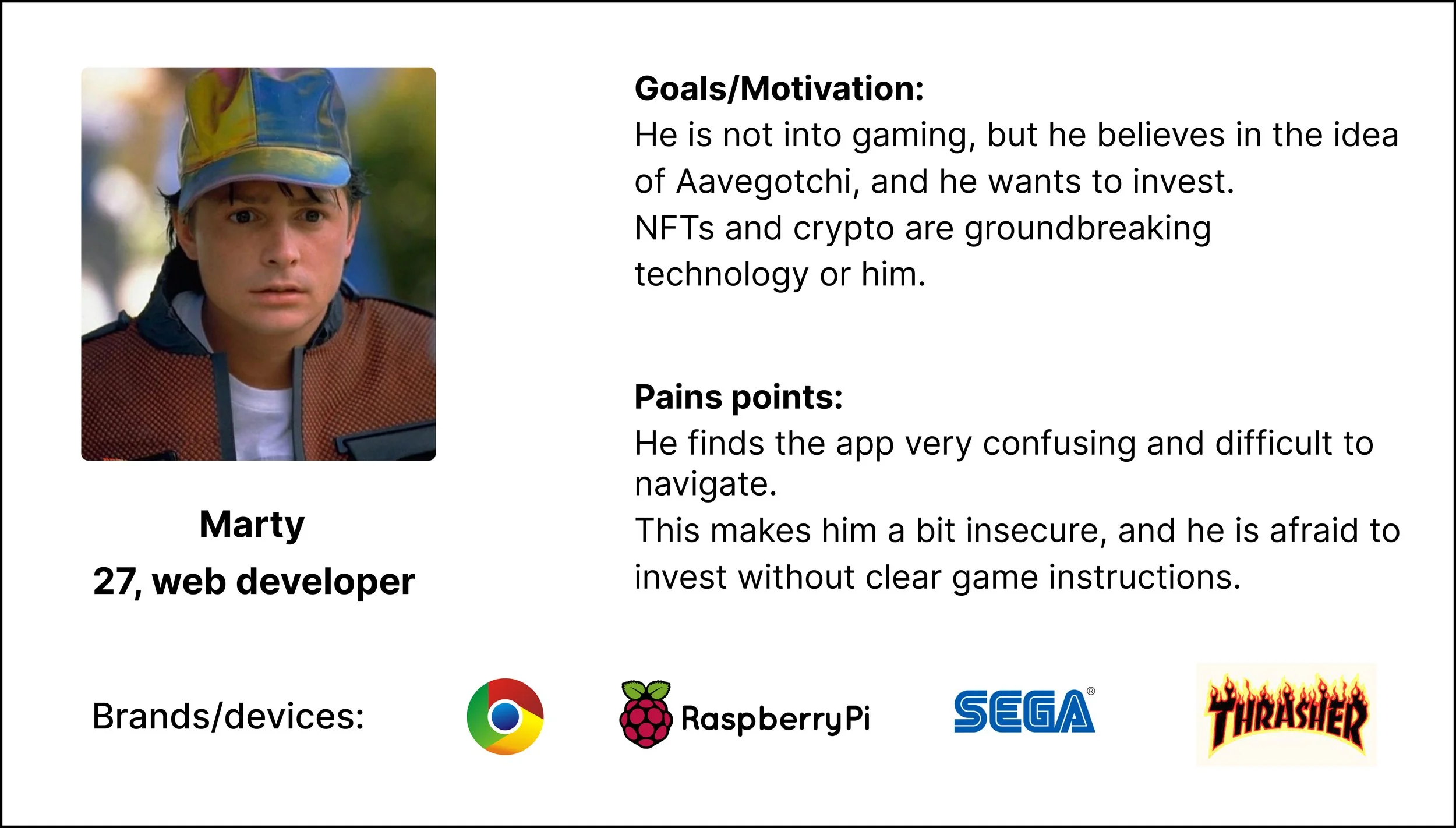
User Personas
Based on our research findings, we identified three distinct types of Aavegotchi users and created detailed personas for each. While their behaviors, interests, and gaming habits differ, all three share a common challenge: the lack of clear guidance in the game, which creates hesitation around making smaller or larger in-game investments. These personas helped us empathize with real users and guided our design decisions to make the onboarding experience more approachable and intuitive.

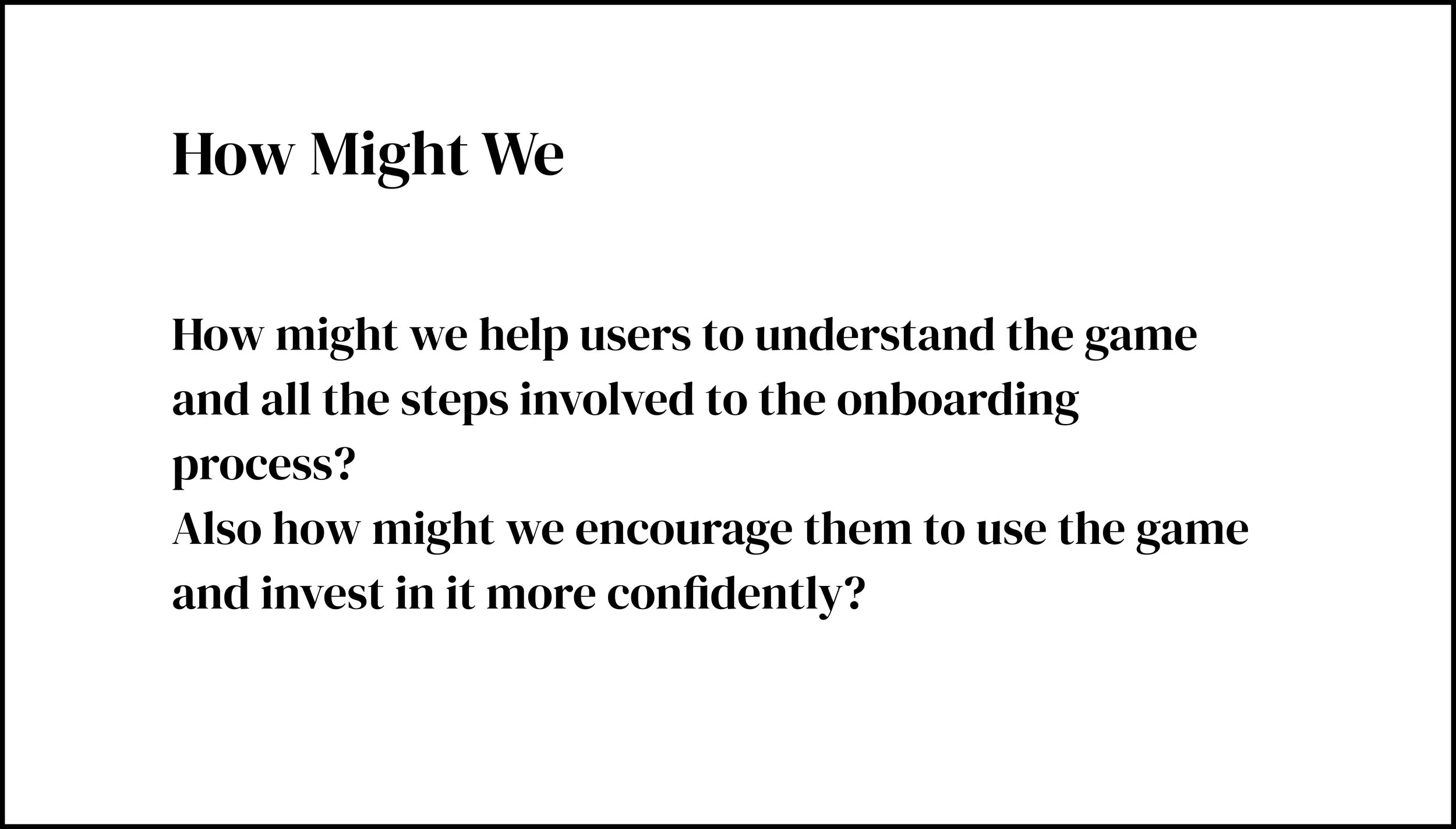
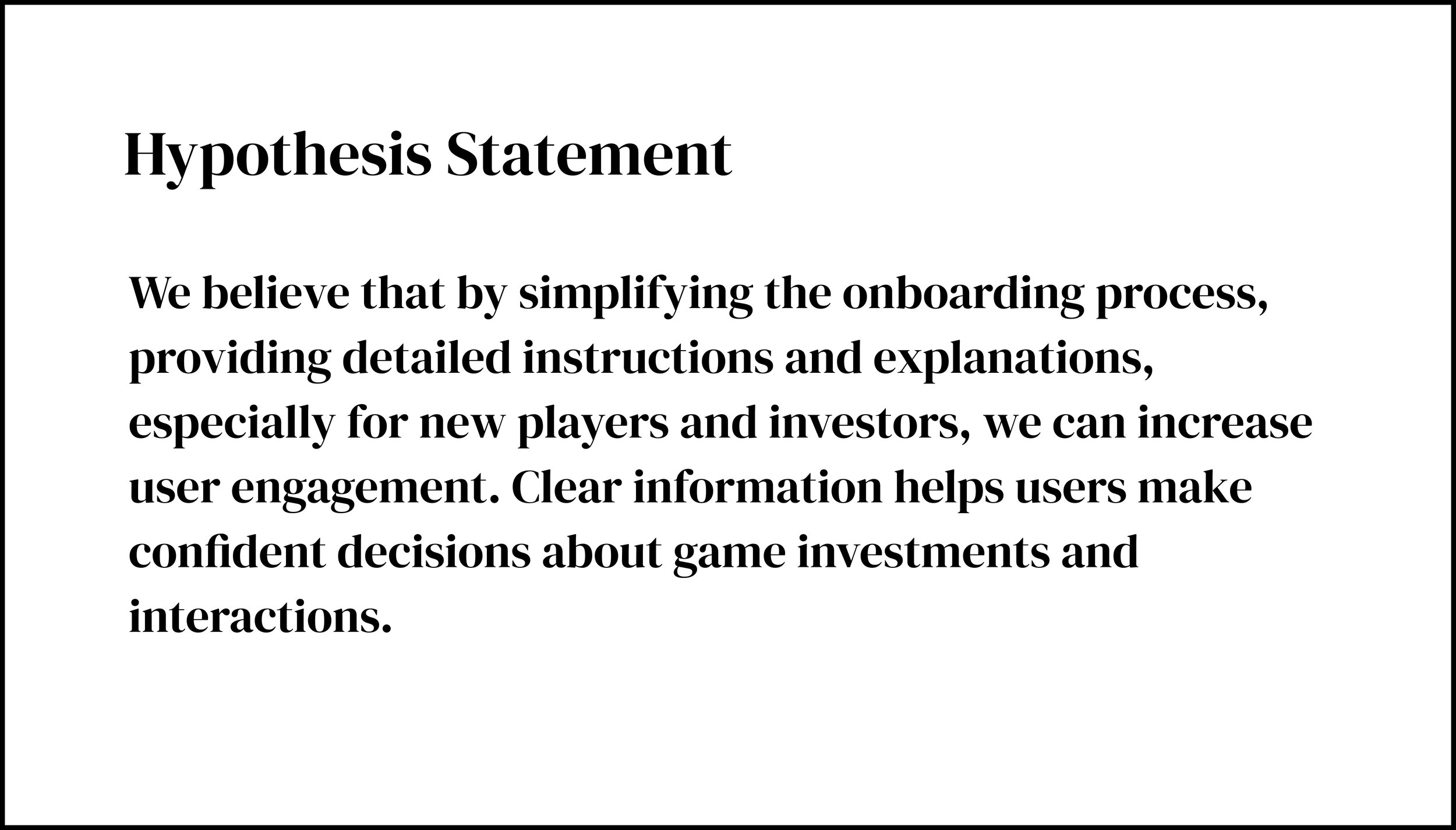
How Might We, Problem & Hypothesis Statement
With the analysis that we made, and after collecting all informations that we needed, we formulated a Problem Statement , How Might We and Hypothesis Statement before entering the Ideation phase. Main problem that needs to be solved is clarifying of on boarding process by giving clear navigation to new users, guiding them step by step and in that way to help them to understanding the game better.
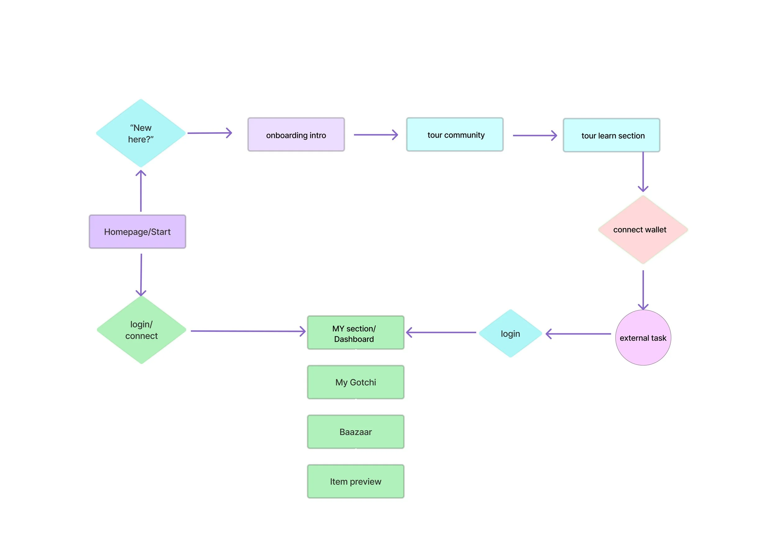
User Flow
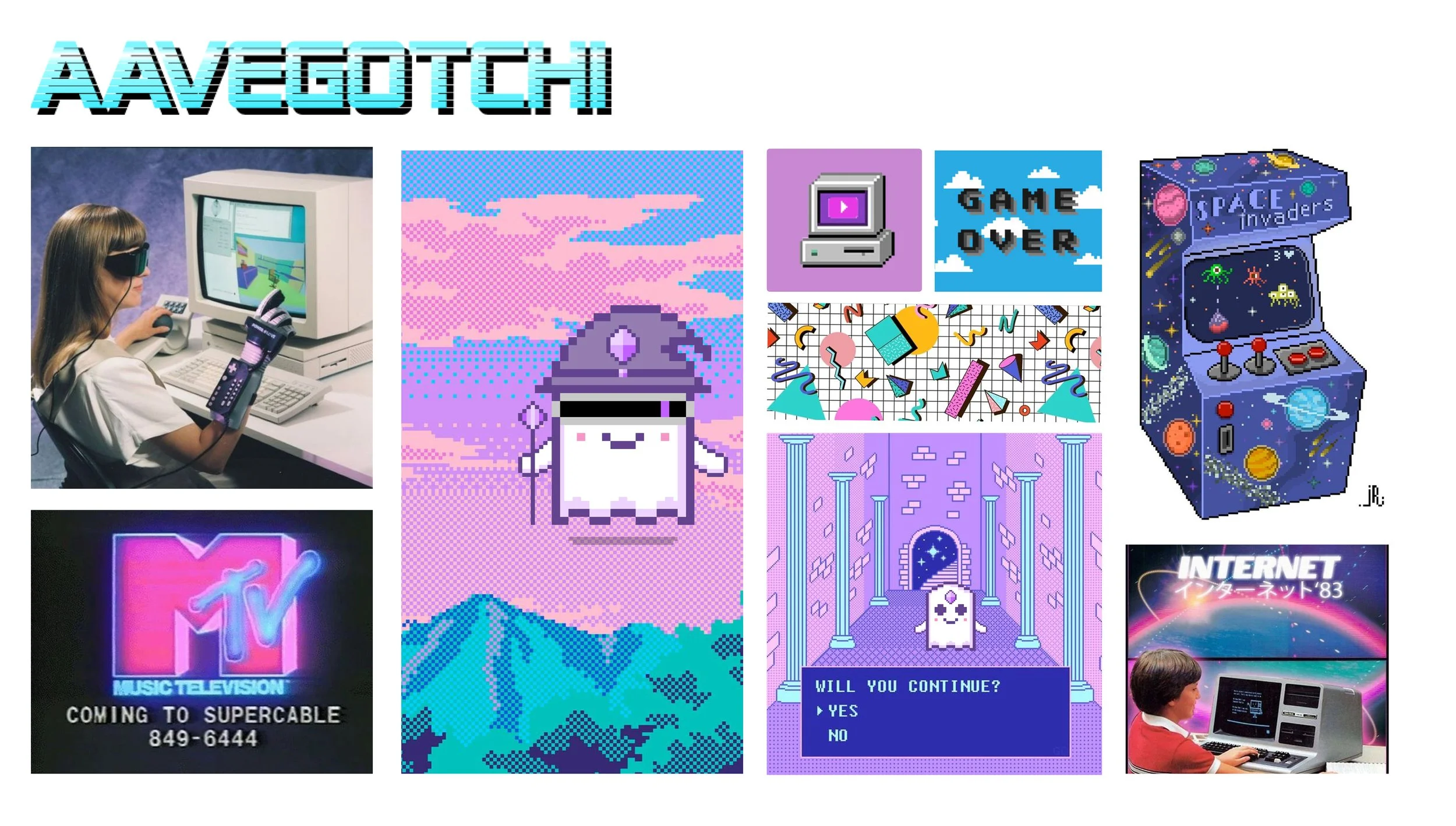
Mood board
Following the stakeholder’s directions, we respected the existing branding, including color palette and button styles, as they did not want significant changes. However, we wanted to leave our personal touch on the project. Drawing inspiration from 80s video games, Memphis design, and Miami Vice aesthetics, we experimented with pastel tones, pixel art, and geometric patterns. These playful adaptations enhanced the visual personality of the desktop experience while keeping the core branding intact.
Crazy 8 and Mid-Fi Prototype

After thoroughly analyzing insights from interviews and surveys and developing a strong understanding of user needs and stories, the initial contours of the product began to take shape. We started ideation with the Crazy 8 method, rapidly sketching multiple layout and interaction ideas. These explorations informed the creation of a Mid-Fidelity prototype, which allowed us to test and refine user flows before moving on to the final high-fidelity design.

High-Fidelity Prototype
Building on the Mid-Fidelity explorations, we developed a High-Fidelity prototype that brings the redesigned onboarding flow and desktop interface to life. The prototype reflects all insights from research, interviews, and personas, providing clear guidance for new players and an intuitive, app-like experience while staying true to Aavegotchi’s original branding.
You can explore the prototype in Figma by clicking the button below. Have fun!
Hi-Fi Prototype
Conclusion & Next Steps
The redesign successfully clarified the onboarding process, simplified navigation, and improved overall user experience. New players can now engage with the game confidently, with clear step-by-step guidance and better access to key features such as the in-game marketplace (Baazaar).
Next Steps:
Conduct user testing on the High-Fidelity prototype to validate the new onboarding flow.
Add micro-interactions or tooltips to further support complex game mechanics.
Explore mobile adaptation for responsive access across devices.
Monitor player behavior post-launch to identify any remaining friction points and iterate accordingly.